Entry
Viverant Physical Therapy Branding
Submitter:
Jodi Eckes
Company:
DRIVE
Concept/Purpose of the Work:
Viverant Physical Therapy is a challenger brand in the traditional physical therapy market. They’re a holistic wellness company offering physical therapy, nutrition and clinical performance coaching with the goal of helping people live without limits and without pain. The goal of the brand refresh was to better reflect their mission and culture, as well as further differentiate them from competitors and strengthen their position within the market.
The logo’s mark symbolizes the intersecting paths of the physical therapist and patient on this journey towards a life without limits. It also was designed to resemble both a “V” (for Viverant) and a “heart” (representing their personalized approach to care and strong commitment to their patients). The mark’s movement and energy are enhanced by Viverant’s signature citrus brand color, and successfully balance the clean lines and minimalist approach to the logo’s typography.
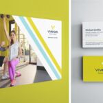
The identity’s vibrant — yet minimal — color palette and predominant use of white is balanced with a subtle geometric pattern, strong diagonal angles and crisp, vibrant photography. A key component in developing a stronger brand identity for Viverant was the creation of their own brand imagery, showcasing actual Viverant physical therapists in action — all in a photography style that is bright, colorful, optimistic and welcoming. Another integral part of the identity is the “Dual Path” graphic which represents the patient’s trusted partnership with their therapist on their wellness journey. The Dual Path helps create Viverant’s signature look, while also helping build this sophisticated, progressive identity.
Results of the Work:
This brand refresh played a crucial role in the strategic evolution of Viverant Physical Therapy, helping successfully position it for growth. The brand launch was met with much enthusiasm and positive feedback both internally and externally. We are continuing to implement the new environmental branding, and Viverant is currently expanding their locations across the U.S.
How the Work Was Delivered to the Masses:
New stationery systems, marketing collateral, staff-friendly marketing templates, internal and external signage, digital advertising and apparel are all being rolled out across the locations. New branded sales tools have also been developed, and are currently being implemented with the sales team.
Credits:
Creative Directors: Jodi Eckes + Charles Youel
Brand Strategist: Lisa Lynch
Copywriter: Charles Youel
Designer: Jodi Eckes
Photographer: Hickey Photography
Web Firm: fjorge
Tags:
Amiable, Confident, Fresh
Category:
Branding


