Entry
Package Redesign
Submitter:
Monica Johnson
Company:
Link:
https://www.behance.net/gallery/128741267/Sprechers-Sparkling-Water-Label-Redesign
Concept/Purpose of the Work:
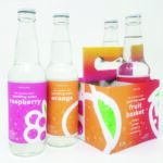
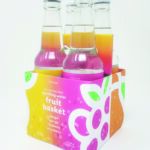
For this project, the goal was to choose an existing line of packaged goods and redesign the packaging for that product. After choosing the product, four different variations were needed to be developed and created. After redesigning the label, the goal then was to mock up the entire line of the packaging of the four designs.
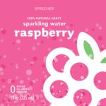
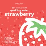
For my choice, I decided to redesign a label for sparkling water. I chose to work with Sprechers, allowing me to work with a glass bottle. Following my decision, I chose four different flavors and created a color scheme that went well between the four designs, each color having a correlation to the fruit it represented. I then created an icon and colored bubble pattern that would then also match what the flavor was. As for the typography, I chose the main parts, "sparkling water" and the flavor be in lowercase, allowing the label to be more friendly and "fun," matching the coloration and design of the labels.
Results of the Work:
All together, the final designs ended up being a more modern, refreshing, friendly, fun, bright, and eye-catching design when compared to the original designs, which has an "older" look to it that seemed less memorable than the other competitors of sparkling water.
How the Work Was Delivered to the Masses:
I published my process document as well as images of the labels and mock-ups on my Behance.
Tags:
Fresh, Sunny, Surprising
Category:
Packaging


