Entry
Northland Pioneers
Submitter:
Garrick Willhite
Company:
Object
Link:
https://object.design/work/pioneers/
Concept/Purpose of the Work:
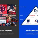
Northland was looking to evolve their athletics brand. There was little affinity with the existing brand and the athletics brand (Pioneers) wasn't inclusive to race and gender. The old logo was a white male early pioneer settler with a Davy Crockett hat.
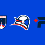
Our approach was to create a unified mark for both the academics and athletics programs with a monogram that could work for both. We also needed to redefine what a pioneer was to be more inclusive to race and gender. The old athletics brand was focused on the past with a settler interpretation of the name Pioneers. We changed the interpretation to focus on the future - an astronaut, the space pioneer. With so many of Northland's programs associated to the advances put forth through space exploration it was a natural and progressive fit.
Results of the Work:
The new branding has been extremely well received. The work was featured on Brand New an international design blog. Students and faculty did not like the old Pioneer branding and have fallen in love with the new brand. The coaches and AD have used it as a primary tool to assist with recruiting.
How the Work Was Delivered to the Masses:
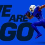
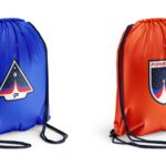
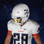
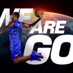
We created a new meaning for the Pioneers name. This resulted in a new spirit mark of the astronaut named Astro. Astro is inclusive to race and gender. Astro also was more playful and focused on the future than the past. We created a new wordmark, new spirt mark, new jerseys, new numbering system, apparel, and a new campaign rallying cray – "We are go" short for we are go for takeoff.
Credits:
Garrick Willhite, Founder/Design Partner
Bill Gunter, Designer
Nikki Meyers, Designer
Tags:
Confident, Expansive, Fresh
Category:
Branding


