Entry
Hubble Grotesk – Typeface Design
Submitter:
Rishi Murugesan
Company:
Ordinary Type Foundry
Concept/Purpose of the Work:
I started college as a double major in Astrophysics and Physics. But after 2 1/2 years, I knew I need a change. That lead me to switching to graphic design, a field where aesthetics AND analysis go hand-in-hand.
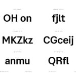
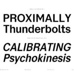
Due to my background, I kept looking for a ""scientific"" typeface but everything I found was too rigid, too synthetic, too dull. Science to me was challenging, interesting, mechanical, imperfection and fun. This lead me to creating Hubble Grotesk.
It's a typeface that feels smart without feeling stuffy. And that's all I've ever wanted.
Results of the Work:
By working on this project, I slowly transitioned from a graphic designer who used typefaces into a type designer that does graphic design. This undertaking completely changed my career direction and has helped me meet interesting designers all over the world. It also has helped me understand and appreciate type designers and their craft even more.
How the Work Was Delivered to the Masses:
This the first time the ""masses"" will see my work apart from other type designers!
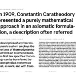
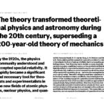
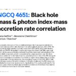
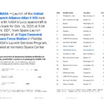
A typeface specimen was created for the public to understand my thought process as well as see the typeface in action.
Credits:
Typeface Reviewers: David Jonathan Ross, Nicole Dotin, Sol Matas, Vincent Chan, Christian Schwartz, Mark Simonson
Thank you all for your feedback and encouragement.
Tags:
Confident, Industrious, Resourceful
Category:
Miscellaneous


