Entry
Clarity Financial Identity Design
Submitter:
Milla Kicilinska
Company:
Motif Design Group
Concept/Purpose of the Work:
Clarity Financial is a leader in managing family wealth with its personalized, hands-on approach. Pioneers in the impact investing space wanted to establish their identity and create a cohesive
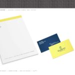
visual system. My job was to create a logotype and prototype of identity systems, including collateral, wayfinding, signage, tradeshow installation, color palette, patterns etc.
Results of the Work:
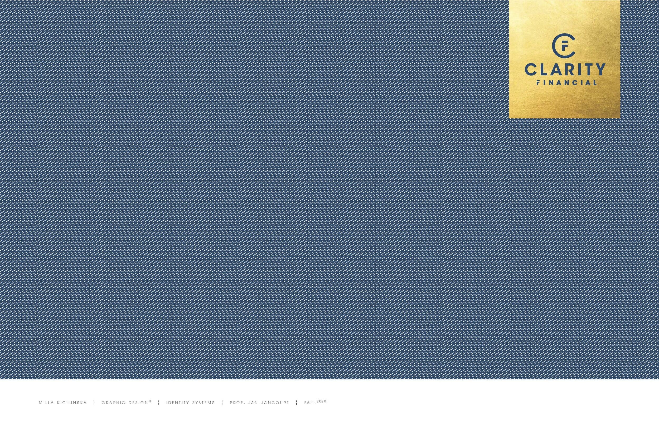
Creating an identity that is unique for the financial industry and that matches the personality of the owners. Making a logo was the core of the project. Monogram CF stands for Clarity that holds the financial assets within, giving the sense of protection for financial security. The color palette and its philosophy were selected based on the psychology of color, with royal blue representing trust and mental comfort. It is also the color of building relationships. The second color is most of the limns of the spectrum. It is a color of attention, happiness, positivity, and creativity. Gold, used as the metallic foil, is the symbol of wealth and great accomplishment. The design also gives a boutique feel, which Clarity Financial as a firm is all about. We used the $ symbol to create a visual system of patterns, motifs, and icons that match their energetic work philosophy. This symbol group without ending boundaries or edges represents moving forward and speaks to financial growth and flexibility.
How the Work Was Delivered to the Masses:
This was a school project created at the Professional Practice class. The project was given to the owners of Clarity Financial and they will be working on bringing this identity to life. They are currently shopping for an office space.
Credits:
Milla Kicilinska
Tags:
Fresh, Resourceful, Restless
Category:
Student Work

