Entry
REV Real Estate
Submitter:
Derek Sussner
Company:
Sussner Design Company
Link:
https://www.revrealestatecody.com
Concept/Purpose of the Work:
For 15 years, the founders of REV Real Estate have provided customers with many restful nights’ sleep - even throughout the buying and selling process. REV launched to serve homeowner and business real estate needs in the state of Wyoming. The objective for the new brand is to position REV as an innovative and welcoming company that stands out among the other local agencies. REV’s brand tells a story, connects, and engages the community they are actively part of.
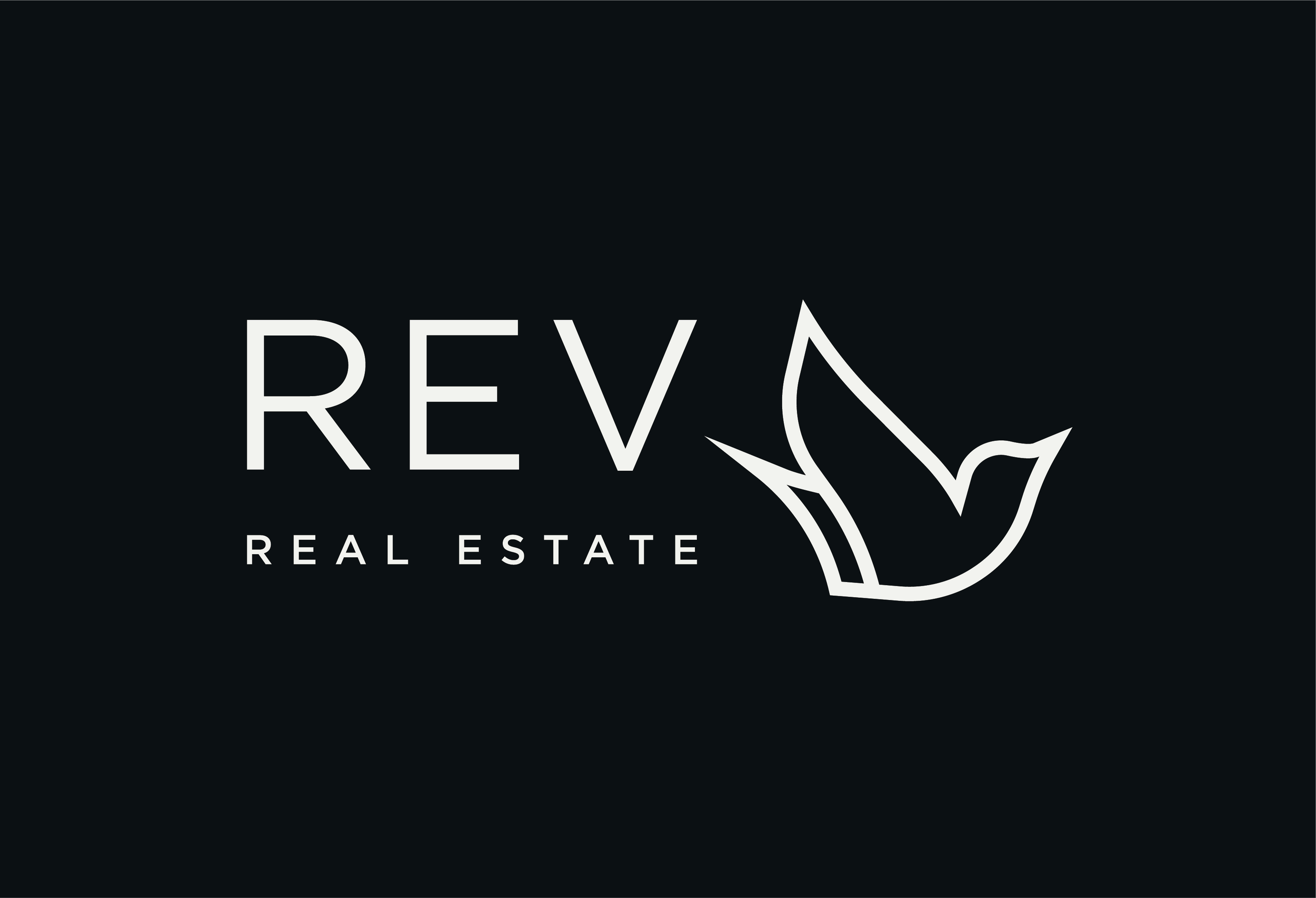
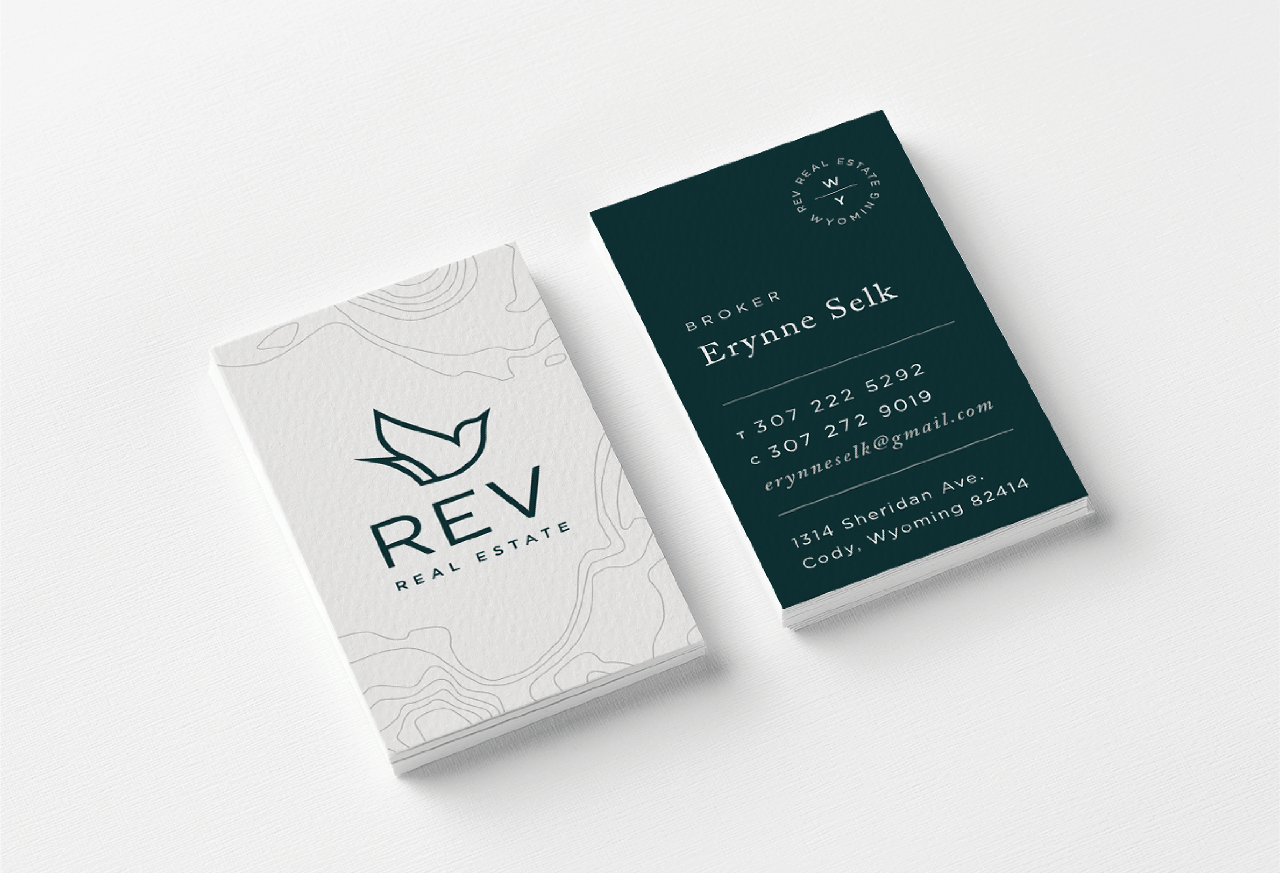
Inspired by the Western Meadowlark, the state bird of Wyoming, the logo symbolizes freedom and a sense of place. The Meadowlark has a beautiful personal song and a unique capability to build a structurally sound roof over their nested homes.
Results of the Work:
From Erynne Selk, Broker/Owner, REV Real Estate: "Our logo has quickly become recognized locally, and we have had an incredibly positive response to our brand, our story, and our website. I knew we could build this, but the local response has been more positive than we could have imagined."
How the Work Was Delivered to the Masses:
The REV identity engages people with printed business cards, stationery, print collateral, swag, signage, and through their website: https://www.revrealestatecody.com/
Credits:
Senior Designer: Tanya Jacobson
Art Director: Tessa Sussner
Creative Director: Derek Sussner
Copywriter: Kevin Freidberg
Website Developer: Bret Hummel
Printer: Franklin Press
Tags:
Candid, Grateful, Resourceful
Category:
Branding

