Entry
Quality Bicycle Products Rebrand
Submitter:
Allison Long
Company:
Quality Bicycle Products
Concept/Purpose of the Work:
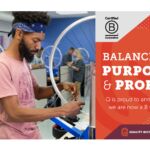
Quality Bicycle Products has evolved from being solely a distributor of bikes and parts to being a thought leader and trusted business resource for our partners. With our changing role in the industry, it was a good time to take stock of who we are, what we stand for, and how we communicate that.
Q has a strong position in the cycling industry— we are a connector that ties together bike shops, suppliers, and communities. We needed a brand that reflects our role as an active leader, that conveys the passion that our employees bring to work every day.
Results of the Work:
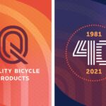
Quality Bicycle Products now has a strong, memorable visual identity that aligns with our brand purpose and promise. We appear more professional and up-to-date in our communications, and we have used the new look to rein in some visual aspects of the company that had drifted away from the core brand. In this crazy past year and a half, the visual identity and the brand work has given us a north star to help the company stay focused on our vision and promise.
How the Work Was Delivered to the Masses:
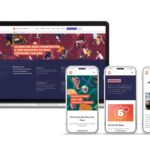
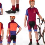
The brand was launched inside the company with new templates and resources, and of course swag. Externally, we updated the public website as well as our business site, and our advertising. We rebranded our events and education offerings to be in line with the new identity.
Credits:
Jay Lusignan, Marketing Director
Allison Long, Creative Director
Matt Larson, Art Director
Greg Birth, Graphic Designer
Renee Hoffman, Copywriter
Foundry Web Works, Web Design
Jenny Barr, Illustration
Marty Wood, Photographer
Tori Kosel, Photographer
Gensler, Brand Research & Insight
Tags:
Amiable, Confident, Industrious
Category:
Branding


