Entry
Misfit Coffee
Submitter:
Garrick Willhite
Company:
Object
Concept/Purpose of the Work:
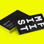
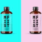
MISFIT coffee was looking to update their visual identity. The new identity was designed to have the same crazy and offbeat vibe as MISFIT, a Minneapolis/St. Paul coffee company. The flipped and reversed "FIT" is a visual metaphor showing how MISFIT strives to do things differently. Another play on the word "FIT", we designed the identity to change and adapt for specific applications.
Results of the Work:
Marcus, the owner of MISFIT strives for quality and the unique and appropriate branding helps elevate the perception of the coffee brand. People from all over love posting pics of their bright-colored MISFIT coffee cups.
How the Work Was Delivered to the Masses:
We create a new visual identity system and also packaging for the coffee shop.
Credits:
Garrick Willhite: Founder/Designer Partner
Eric Drommerhausen: Designer
Ian Babineau: Illustrator
Tags:
Charming, Confident, Surprising
Category:
Branding


